Why Do Claude Designs All Look the Same?
An independent designer named Matt Ström-Awn had two startup clients show him their sales decks. Same bright opening slide, mission in three bullets. Same second slide, four rectangles for the market. Same third slide, one line reading "our move." Different logos, identical decks.
Both came out of Claude Design, Anthropic's AI design tool, which, he told The New Yorker, "defaults to the same aesthetic for every single person that's using it." The default look is not neutral wallpaper. It is a stack of decisions the tool makes for you, and it is worth asking what you gave up by letting the tool decide.
Is the sameness lazy design, or the tool's default?
The tool's default, and it is not close. Every AI design tool ships with a house style and applies it unless you push back, so the sameness is the tool's doing, not a room full of lazy designers.
You have seen the look even if you have not named it: cream and beige backgrounds, a rusty-orange accent, big serif type in italics, subheadings with the letters spaced far apart, ticker-like bars as if the page were a news channel, dashboards of rounded rectangles.
Here is the default distilled, then the same grammar in the wild across two unrelated industries.
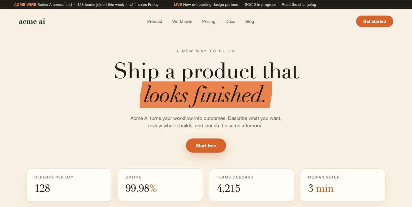
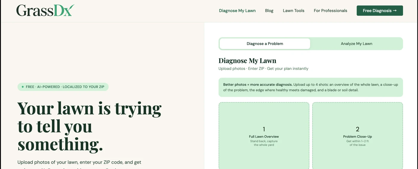
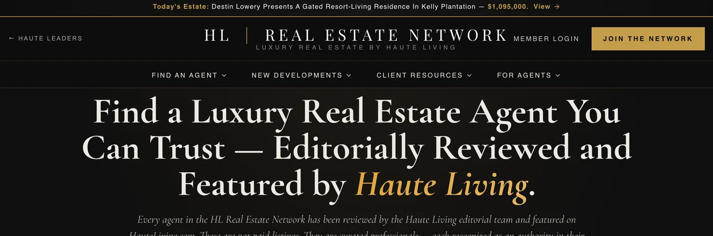
Anthropic says so in its own guidance. Its Claude Design documentation concedes the model "has strong design instincts, with a consistent default house style," and, in its own words, "This default is persistent."
Telling it to stop mostly moves the problem. The company notes that a generic instruction like "don't use cream" tends to "shift the model to a different fixed palette rather than producing variety." The tool has a taste, defaults to it, and correcting it lightly just relocates the default.
Call it the design version of an em-dash tell. Overused em-dashes and "not this, but that" constructions read as a giveaway that a machine wrote the words. A look this consistent across unrelated sites is the same tell, one layer up.
What colors do AI design tools default to?
A warm cream or beige field, near-black ink, and one saturated accent, most famously rusty orange. Those are not adjectives, they are measurable values: the swatches below are sampled from our mock of the default and from the two real sites in the figure above.
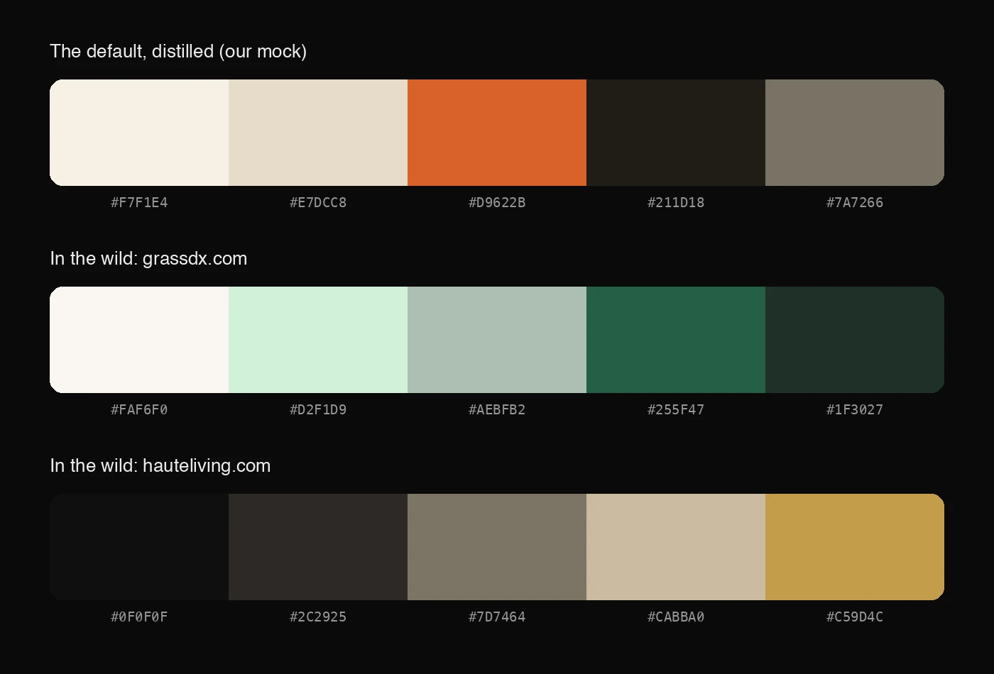
Swapping the hue does not escape the grammar. Anthropic already told us why: a generic correction like "don't use cream" shifts the model to a different fixed palette. The mint-and-forest palette is the cream default spoken in green. The near-black-and-gold one is the same structure after dark: the field darkens, the accent turns gold, the roles never change.
The palette is a symptom, not the disease. What repeats is the structure (a quiet field, dark ink, one accent doing all the work), because that is what the tool reaches for when nobody steers. Escaping it takes a direction, not a color swap: pick the palette your brand owns, and make the tool hold it.
Is using AI design tools bad for your brand?
Only if you let the default answer for you. The default is not the absence of a decision. It is a decision, made by the tool, now shared by everyone else who also did not decide. Ship it and you did not save the design work. You skipped the one part of it that was yours.
This is our manifesto line rendered in pixels: AI amplifies your direction, right or wrong. Give the tool a direction and it sharpens your intent. Give it none and it supplies its own, the same one it hands everyone. The generic result is not the tool failing. It is the tool doing exactly what it does when no one aims it.
Do not confuse this with a problem we wrote about before. That one was about the AI apps themselves, ChatGPT, Claude, the assistant panes, and why their blank interfaces all converge: a deliberate, smart move, because an empty surface invites you to project onto it.
This post is not about the apps. It is about what the design tools build for you, the output. That sameness is the stickier one, because the interface convergence was the vendor's choice made on purpose, and this is a default you inherited without ever choosing it.
What is design taste, and why does it matter more with AI?
Taste is the judgment to choose what is right instead of what is default, and to tell finished from merely good-enough. It sounds soft until you notice it is now the scarce input. When a passable design costs twenty dollars a month, passable is everywhere, and the rare thing is the direction that makes one piece of work distinct.
This is the oldest lesson in software, not a new one. Fred Brooks wrote in 1986 that "the hardest single part of building a software system is deciding precisely what to build." AI drove the cost of building toward zero and left that hardest part exactly where it was.
Design is no different. The tool made the drawing cheap and left the deciding to you. We have said the same about code, that the bottleneck moved from making to knowing what to make.
Celine Nguyen named the tradeoff. The mid-century Eames credo was "the best for the most for the least." What an AI design default offers, she said, is "the pretty good for the most for the least effort, and pretty low cost." A real bargain for most work. A bad one exactly when distinctiveness was the point.
How do you get a distinctive design out of an AI tool?
You treat the default as a starting point to push against, not a finished product. The designers who get original results out of these tools are not avoiding them. They are doing more work, on purpose, before and after the generation step.
The pattern they describe is direction first. One designer builds mood boards and hand-sketches drafts, then feeds that into the generator with a description of the result she wants, so the output carries her references, not the tool's. It is the same discipline as directing an AI toward the right feature instead of the first one it offers.
The job of the designer is to stay with uncertainty long enough to discover something new.
The sameness runs deeper than color. These tools also steer everyone toward the same handful of off-the-shelf code building blocks (shadcn, Radix, Drizzle), so the uniformity reaches into the structure, not just the paint. One engineer compared it to the marks machines leave on mass-produced goods. Distinctiveness has to be chosen at every layer, because the tool defaults at every layer.
That direction does not have to live in your head, either. It can be written down and handed to the tool as standing instructions, which is exactly what we built The Designer to do. More on that below.
Does AI replace designers?
No. It replaces the easy, generic part of design and raises the value of the hard part. Anyone can now generate a competent-looking layout, so competence stopped being the thing that sets work apart. Judgment, a point of view, and knowing your audience became that thing instead.
The role shifts from producing the visual to directing it, which is where a designer's value always lived. The tool is a faster hand. It is not a point of view, and it will hand you its own the moment you fail to supply one.
The default is a decision you keep making
Here is the detail that lands it. Anthropic's newest model marketing moved to a distinctive look of its own, collaged vintage naturalist illustrations, insects and flowers, plainly an attempt to escape the company's own cliche. And the designers watching already expect that look to get copied and flattened in turn. No default stays distinctive once it becomes the default.
None of this means always fight the default. For plenty of work it is genuinely fine. An internal deck does not need bespoke taste, and reaching for the tool's house style there is the right call.
The claim is narrower and more useful. Know when the default is quietly costing you the exact thing meant to set you apart: your brand, your pitch, the first impression of your product. That is when the decision you skipped was the one that mattered.
Distinctiveness is not a setting you toggle once. You keep bringing it, or the tool chooses for you.
How do you write your taste down?
Everything above lands on the same move: the tool needs a direction, and the direction has to come from you. The practical question is how you hand it over.
The unglamorous answer is that you write it down. A palette with real hex values. Typefaces with names. The density you want, the motion you will tolerate, the defaults you refuse. AI coding tools follow explicit instructions remarkably well. What they cannot do is guess them. A written design ethos turns every future generation from "surprise me" into "build it my way."
Most people never write one, because articulating taste is genuinely hard. So we made it a conversation instead. The Designer, our design agent, interviews you about how your product should look and feel: real palettes to tap, type to compare, trade-offs to slide. Ten minutes later you have the written ethos, ready to paste into Claude Code.
 Free tool
Find your design ethos.
The Designer, our design agent, interviews you for about five minutes: real palettes to tap, type to compare, trade-offs to slide. You leave with a written design ethos ready to paste into Claude Code, so it builds in your style instead of the default.
Free · ~5 minutes
No spam.
Frequently asked
Why do AI-designed websites all look the same?›Because AI design tools have a default house style and apply it unless you fight them.
What colors do AI design tools default to?›A warm cream or beige background, near-black ink, and one saturated accent, most famously rusty orange (sampled values: cream #F7F1E4, ink #211D18, orange #D9622B).
Is using AI design tools bad for my brand?›Only if you accept the default. The default look is now recognizable as an AI giveaway, the way overused em-dashes signal AI writing, so a site built on it reads as generic on arrival.
What is design taste and why does it matter more with AI?›Taste is the judgment to choose what is right rather than what is default, and to tell finished from good-enough.
How do you get a distinctive design out of an AI tool?›Treat the default as a starting point to push against, not a finished product.
Does AI replace designers?›It replaces the easy, generic part of design and raises the value of the hard part.
How do you give an AI design tool your own taste?›Write it down as explicit instructions: exact colors with hex values, named typefaces, density, motion, tone of voice, and the defaults you refuse to accept.
Let’s build it together.
We turn clever prototypes into production systems people can rely on. If you’re building with agents and want a hand making it real, leave your email and we’ll be in touch.