Why AI Apps All Look the Same: The Faceless Mannequin Returns
I was rewatching Mad Men a few weeks ago. Season One, "Marriage of Figaro," the episode where Don visits Menken's department store. Somewhere in the middle of the rewatch a connection started forming, and once I saw it I couldn't stop seeing it everywhere.
The mannequins in the windows of that era were starting to lose their faces.
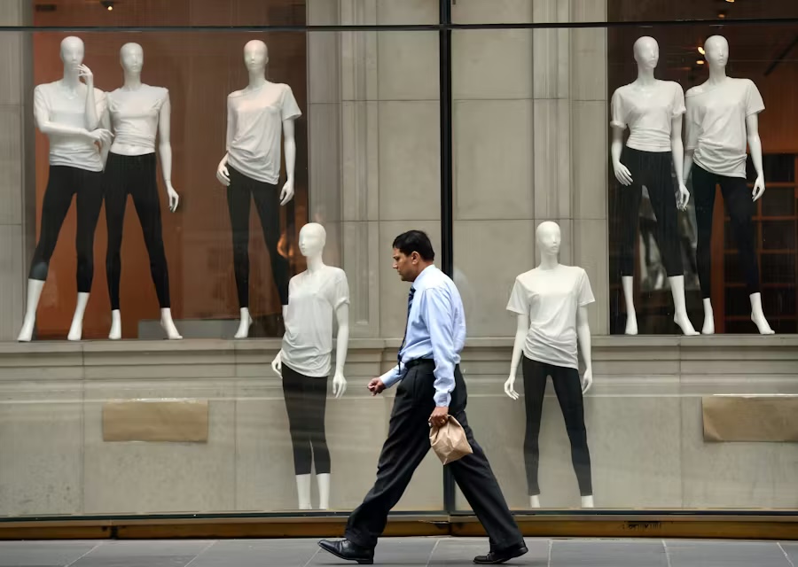
Until about 1959, retail mannequins had specific painted features: eyebrows, lipstick, expressions, identifiable women. Then Adel Rootstein released a collection of abstract ones. Pucci followed in the early 60s. By the end of the decade, the featureless mannequin was the default in department stores around the world. The change wasn't a fashion cycle. It was a structural retail choice, and I think it has something important to teach us about every AI app I have open right now.
Why did mannequins lose their faces?
The painted-face mannequin said something specific: this dress is for that woman. The shopper either recognized herself or didn't. If she didn't, she moved on. That worked when a department store served a single demographic and could afford to be specific. It stopped working when mass retail wanted to open the door wider.
The featureless mannequin made a different offer. It said nothing about the buyer. The shopper looked at the form and saw herself by default, because nothing in the surface told her she wasn't the audience. The dress became hers through the looking. The face came off so the buyer could put hers on. This was a structural decision, not an aesthetic one.
The mechanism is older than retail. It's projection: a blank space fills with the looker's expectations. A logo with too much specificity narrows its audience. A novel with too much physical description of the protagonist limits how many readers see themselves in it. Blankness widens the door.
That was the 50s and 60s in retail. Now it's happening in software.
What do AI apps look like right now?
Open ChatGPT. Open Claude. Open Notion AI. Open the AI assistant pane in whatever productivity tool you're working in. Open the AI tab in Slack. The Gemini sidebar in Google Docs. The Copilot chat in Microsoft 365. They all share a surface. Flat backgrounds. Empty input fields. Minimal chrome. A placeholder that asks "what can I help you with?" or some near-identical variation.
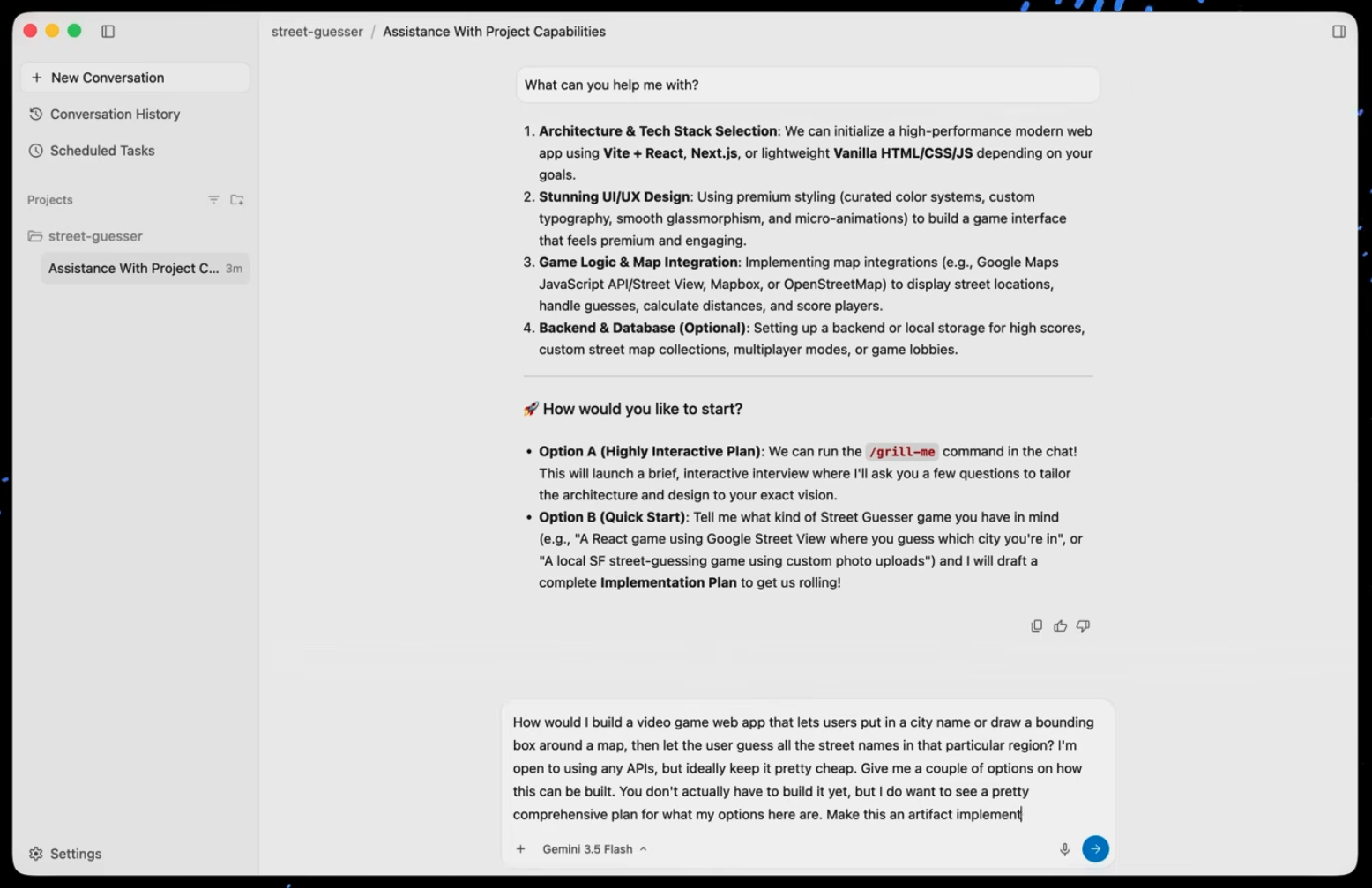
And it is not just chat apps. AI assistants, AI productivity, AI search, AI scheduling, AI everything. They all start in the same place. A neutral surface. A box that waits for you to say something.
I had been irritated by this for months before I realized I was looking at the same move retail made sixty years ago. The mannequins lost their faces so the shoppers could put theirs on. The AI apps are doing the same thing.
This isn't a complaint about lazy UX. The same flatness that reads as bland from one angle reads as ready-to-become-yours from another. There is nothing in the chrome telling you this app isn't for you. So by using it, it becomes yours.
One distinction to keep straight. This is about the AI apps themselves, their interfaces and input boxes, not the look of what those tools generate for you. That output sameness is a different, stickier problem: the interface here is the vendor's smart choice, and that one is a default you never chose.
Is this just the next round of blanding?
Kyle Chayka named the earlier version in 2016. His piece Welcome to Airspace described how Airbnb-era travel had flattened global interior design into a single sterile aesthetic. Ben Schott later coined "blanding" for the consumer-brand version. Ryan Duffy's synthesis on Medium collected the lineage.
If taste is globalized, then the logical endpoint is a world in which aesthetic diversity decreases. It resembles a kind of gentrification.
The natural framing is that AI software is just the next chapter. Same forces every time: pattern matching, taste flattening, capital flowing toward what looks familiar.
That framing is partly right but it misses what's new.
The earlier waves were convergence by accident. The fix was always "differentiate more." Conformity was a failure mode.
AI-era sameness is different. It's convergence by design. Each vendor independently arrived at the same conclusion: the surface should commit to nothing, because the personalization layer behind it commits to everything. Same pattern. Completely different mechanism.
What changed underneath?
The mannequin's offer worked because the dress was real. The buyer projected herself, then bought actual fabric. The projection found something solid behind it.
The AI app works the same way. The buyer brings her own context, her own questions. The model adapts to her. The surface stays blank. The depth fills in.
That depth wasn't possible two years ago. The chrome had to compensate when the personalization didn't. Now the personalization is reliable enough that the chrome can disappear.
The flatness is earned. Vendors are trusting that the model knows enough about you within the first five exchanges to produce a different experience than your colleague gets from the same product. The faceless mannequin is genuinely smart. So is the faceless AI app. Calling either one a failure of design misses what they're for.
But honoring something doesn't mean liking all of its consequences.
What does facelessness cost you?
The faceless mannequin works for selling clothes. The shopper projects, identifies, takes the dress home, wears it once, decides whether she likes it. The relationship is transactional. The mannequin's job ends at the door.
The faceless mannequin doesn't work as well for teaching you how to dress. There is no opinion in the form. The shopper brings all the styling herself. If she's already a confident dresser, the mannequin disappears from her process. If she's still developing taste, the mannequin gives her nothing back.
Software has the same split. The transactional relationship with an AI app (a one-off question, a quick task, get-the-thing-done) maps cleanly onto the mannequin's strength. Project, identify, use, move on. The flatness is an asset.
The developmental relationship with an AI app is where the cost shows up. If the tool is shaping how you approach problems, facelessness becomes a mirror without depth. You bring habit. The personalization reflects habit back. The tool didn't fail. It delivered you to you, faster and louder. We wrote about a related version of this in why vibe coding fails.
I have watched this happen in real client engagements. The pattern is consistent.
How does this connect to AI amplifying your direction?
AI amplifies your direction. Right direction or wrong, it gets there faster. Clear aim becomes more valuable, not less.
The faceless AI app is the visual surface version of the same dynamic. A tool with no opinions about how the work should be done amplifies whatever way of working you bring it. Clear intent, distinctive output. Habit, more habit faster.
The faceless surface is honest in a way that earlier-era opinionated software was not. The opinionated app pushed back, slowed you down, forced you to adapt. The friction did something to you. The faceless app has no friction. It can't. The friction would defeat the projection. So whatever you do with it, you do without resistance. That resistance was a thing some people relied on. Now they have to provide it for themselves.
What does this mean for the tools you build or buy?
Two markets are forming. They are not competing for the same customer.
The faceless mannequin market is broad, transactional, projection-friendly. ChatGPT, Claude, the AI features inside productivity software. They benefit from looking like they could belong to anyone. They will keep being faceless because absorption is what facelessness does.
The opinionated tool market is narrower, deeper, more specific. These are tools built for a particular way of working: a defined cadence of collaboration, a clear opinion about how the work should go. These tools have faces. The user picks them precisely because of the opinion the tool holds.
Both markets are real. The mistake builders are making is choosing between them by accident, defaulting to faceless because everyone else is, without asking whether their user wants to be developed or served.
If you are building, the question is which user you are for. The casual user who wants the tool to disappear? Faceless. The serious user who wants the tool to teach her something? Opinionated. Decide before you design.
The dressmaker
A mannequin without a face is a vessel. So is an AI app without a personality. Both can be powerful. But neither one teaches you how to dress.
The vendors that win the next phase of AI software won't be the ones who removed the face most thoroughly. They will be the ones who put a specific opinion back, for users who want one. The opinion is the way of working the tool embodies. Without one, you are the mannequin. With one, you are the dressmaker.
The market is starving for opinion. That gap is the alpha.
Frequently asked
Why do all AI apps look the same?›Not because the designers are lazy. The flat surface and empty input field are doing the same work faceless retail mannequins did starting in 1959: inviting the user to project.
What is the faceless mannequin effect in software?›It's the deliberate strategy of leaving the visible interface neutral and committing the product's identity to the adaptive layer underneath.
Is the visual sameness across AI software lazy design?›No. It is convergence by design, not convergence by accident.
Is AI software's sameness good or bad?›Both, for different uses. Faceless tools are excellent for transactional work, where you bring a one-off question and get an answer.
What should I build (or buy) given this trend?›Decide whether your user wants to be served or developed. If served, the faceless mannequin design is correct.
Let’s build it together.
We turn clever prototypes into production systems people can rely on. If you’re building with agents and want a hand making it real, leave your email and we’ll be in touch.